The world is in the midst of a digital transformation. In fact, we dare say the digital transformation has already happened. It was well underway before we got hit with the life-changing global pandemic, but the sanitary crisis has significantly fast-forwarded this process. It has put businesses to the test and marked the stark difference between those companies that were ready to thrive into the future, and those that ran the risk of being left behind, many of them ultimately perishing under the strenuous circumstances.
This has been the case, especially for the fashion industry. While many brands had the infrastructure and business model to survive the total loss of in-person shopping and consequential shift to online demand, others were ultimately and utterly blindsided.
As a result, the need for a proper website for one’s fashion brand has become imperative. The thing is, when designing one’s website, one can’t simply think of it as a market for your customers in the sense that a website is so much more than customers coming in, buying something, and leaving. Fashion websites work as online representations of who you are as a brand, and they should be designed accordingly. The experience of going into a store is not the same as going into a website, therefore converting leads becomes a different undertaking.
At the end of the process, you should end up with a fashion website that caters to your brand’s identity, a clean, user-friendly layout, while still rich in content. It should be recognizable, and customers should leave feeling as they know you.
We are aware, however, that knowing which direction to go can be tough when starting off your journey into website design. But trust us when we say, it’s one that’s worth the investment. The work you put into it, will be reciprocated tenfold. Not only when it comes to sales, but also with regards to defining your brand’s identity, and building a legacy.
TNC’s creative agency has worked with many clients, offering web design and development services in order to establish and solidify a brand’s online presence and identity. And only recently, w revamped our website too since as we evolve as a company, so do our goals, and our website should reflect that. We took the time to stop by for a chat with our very own Co-Founder and Business Director Tim Warmolts, who has been in charge of the launch of our new website. What better way to learn something, than straight from the horse’s mouth.
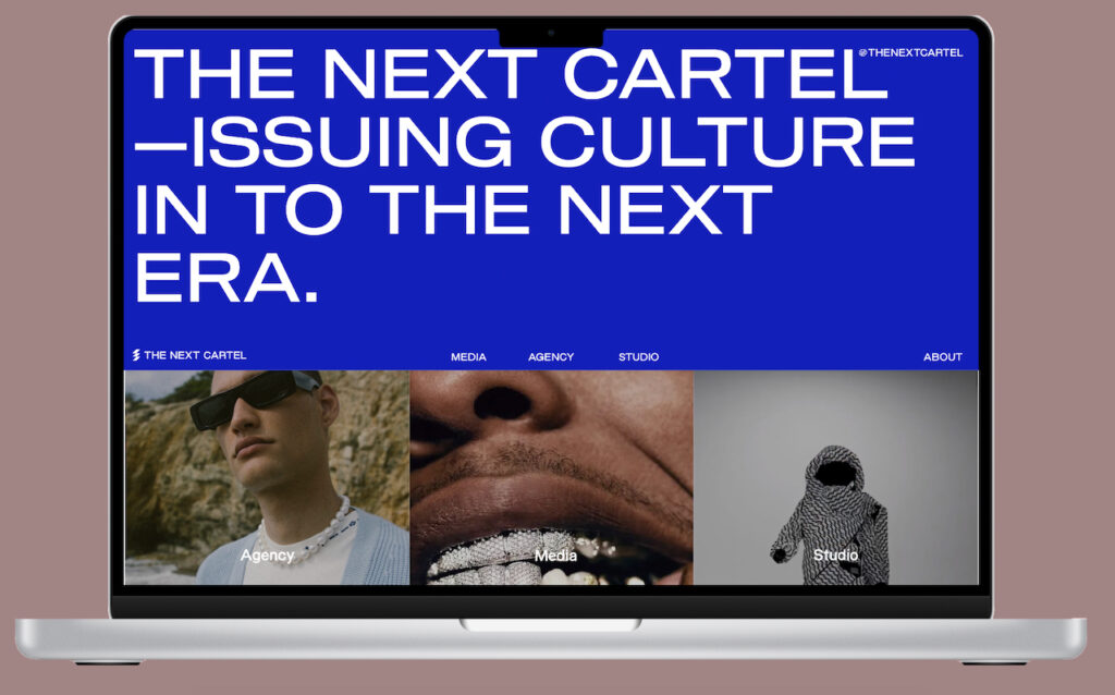
TNC just launched a new website, and it’s looking smashing! Can you tell us about the process and how you feel it’s communicating the soul of the brand?
The idea of a new website had been on the shelf for a while. We didn’t feel that our previous web design was representative of us as a company anymore. As The Next Cartel grew over time into a company built on three pillars – a media platform, creative agency and digital studio -, we knew this should be communicated more strongly. We wanted to convey this in a way that fits the visual level of what we are creating for our clients for example. Our internal ASAP approach made us develop the project in an almost inhumanely tightly timed schedule, which resulted in stressful but hyper focussed situations. Still, I’m delighted with the result and to work together with such talented people who made it possible.
What are you most proud of on the new website, and were there any particular challenges?
The main challenge was to present the three pillars of The Next Cartel, a media platform, a creative agency & a digital studio, all under one umbrella on the same website.
With the arrival of the new website comes the arrival of a colour that represents each pillar of the company:
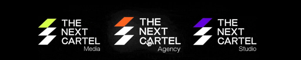
The colours are bright and recognizable but can be tricky to match with other kinds of content. That’s why it was a sophisticated job to incorporate the colours in a minimal but understandable way on the website. It’s not easy to make visitors understand you are providing agency services, design services and selling your own digital fashion collections, while also writing articles for a bigger audience on a daily basis. The main mission of the new web design was to make people understand the TNC universe and to reflect the fact that every pillar is interlinked with one other.
Another challenge was the font selection. Yes, it is a media platform with many articles, but it is also a vision of the future. For font selection, both readability and our futuristic approach had to be considered.
What I’m proud of is the result in general. The website overall is interesting to browse, it represents our three company pillars and triggers first-time visitors to explore more content. Bold visuals and compelling copy go hand-in-hand while performance, mainly because of Google’s core web vitals, is optimised in every possible way.
Also, I’m proud of the incredibly talented team. Anna Franques and Laura Riu took care of design & development and Simeon Ilkov and Matias Torraca made migration possible.
A fashion website should be…
Distinctive, Recognisable & Intuitive
What type of content works better for a fashion website?
A website of a fashion brand or multibrand store should always be an amalgamation of lifestyle and e-commerce (conversion-focussed) content. The style of the content itself is of course dependent on the brand identity and this should be reflected by the web design (and the other way around).
There is a constant discussion within the fashion industry about how products should be displayed. On one side you have the still-life product image partisans, who are convinced that people’s imagination (ex: how to match & how to fit) should be triggered and that shooting on models just provides an unnecessary and most cases unwanted extra load of identity to the products, which might exclude potential buyers.
Then, you have the on-model image partisans who’re convinced that for conversion reasons, it’s important to show fit, match suggestions and a reflection of the brand’s identity immediately, by showing items on a model.
I would say it really depends on the pieces you’re selling and the audience you are targeting. A neutral solution would be to work with both by showing one display approach initially and the other approach on the mouse hover for example. Or let people choose themselves by applying dynamic product cover photos.
What are some of the typical faux pax you often see on fashion websites?
- Many brands have so many stories or such a good story to tell, but forget or don’t know how to translate this on their website. Besides looking up a brand on Instagram, many people just Google on the brand’s name after getting in touch with it on the streets. Your website is your first influenceable opportunity to leave a positive impression. If a website simply presents products, it probably won’t convince people to engage with your brand as it’s not easy to relate to.
- The addition of high-size files to the website is another mistake people often make. They will decrease your chances of getting indexed in Google search results tremendously.
- Having a desktop-only approach. Websites are being created on desktop devices and in most cases, this results in websites that are optimised for these screen sizes while mobile devices aren’t enough considered. UX is of even greater importance on mobile devices than on desktops, as you simply have less space. Intuitively is the essence here.
Minimalist of Maximalist design? Or does it depend on your audience?
It completely depends on the audience. You often see brands with much offline presence and activation, having quite a simple website that has the content, buttons and pages, on the places where you expect them to be. Those brands feel and have less urgency showing off in design as people are familiar with it already. Brands that mainly established themselves online, as most upcoming brands do these days, use their website and social channels to go all out.
In the end, the most important thing is that the design matches the brand’s identity.
A fashion website clearly should prioritise style right? But how does that coexist with UX? What is the right balance for a successful fashion website?
Style can perfectly coexist with UX. A minimalistic website with great UX, could be extremely stylish if the details end up matching. The height and width of elements, the font or the location of certain content, could already make a huge difference.
What might be challenging sometimes though, is being a super stylish, minimalistic brand, while managing to optimise your complete website for conversion. It’s about providing the right information at the right time, to inform visitors during each stage of the process, from landing to checkout, about the perks that stimulate the conversion. Having a lot of text on pages that should prioritise the actual piece you are selling, can be difficult to do stylishly.
If you’re working with a limited budget, what are the basics you should invest in and make sure you have on your website?
It depends on what your goal is. Obviously for a fashion website, investing in web design and decent functionality is key. Also, maybe a little off-topic, the actual product photos that you showcase are something that you can’t economize too much on.
It then depends on your expected main source of traffic. You either invest in, for example, a proper SEO structure and page speed optimisation to get indexed well on search engines, or on special features that contribute to the total experience of your visitors.
Can I design my fashion website by myself? Or do I need professional help?
With all website builder tools that are available these days, you could design and develop a website by yourself. Especially if you start a brand from scratch and your budget is limited, this is a super accessible way to start and have an online presence and the ability to sell. However, once your brand has grown a bit and you start to have more resources, it’s definitely advisable to either invest in professional help with your website or let an experienced company take care of a website from scratch. Your reach, conversion and your brand’s online representation from a visual perspective will have, in most cases, much more potential.
How can I make my fashion website an experience? How can I make it more exciting?
Especially with the digitalisation of the fashion industry, there is a huge potential of exploiting this to a certain extent on your website. Think of embedding digital walkthrough stores, working with (embedded) video content in places where people don’t expect them to be or using 3D models as the main product’s asset so people can turn your pieces around by themselves.
But also think of diving deeper into the production process of your pieces or the story of and around your brand, accompanied by supporting visual content. Providing narrative makes people feel closer and connected to your brand.